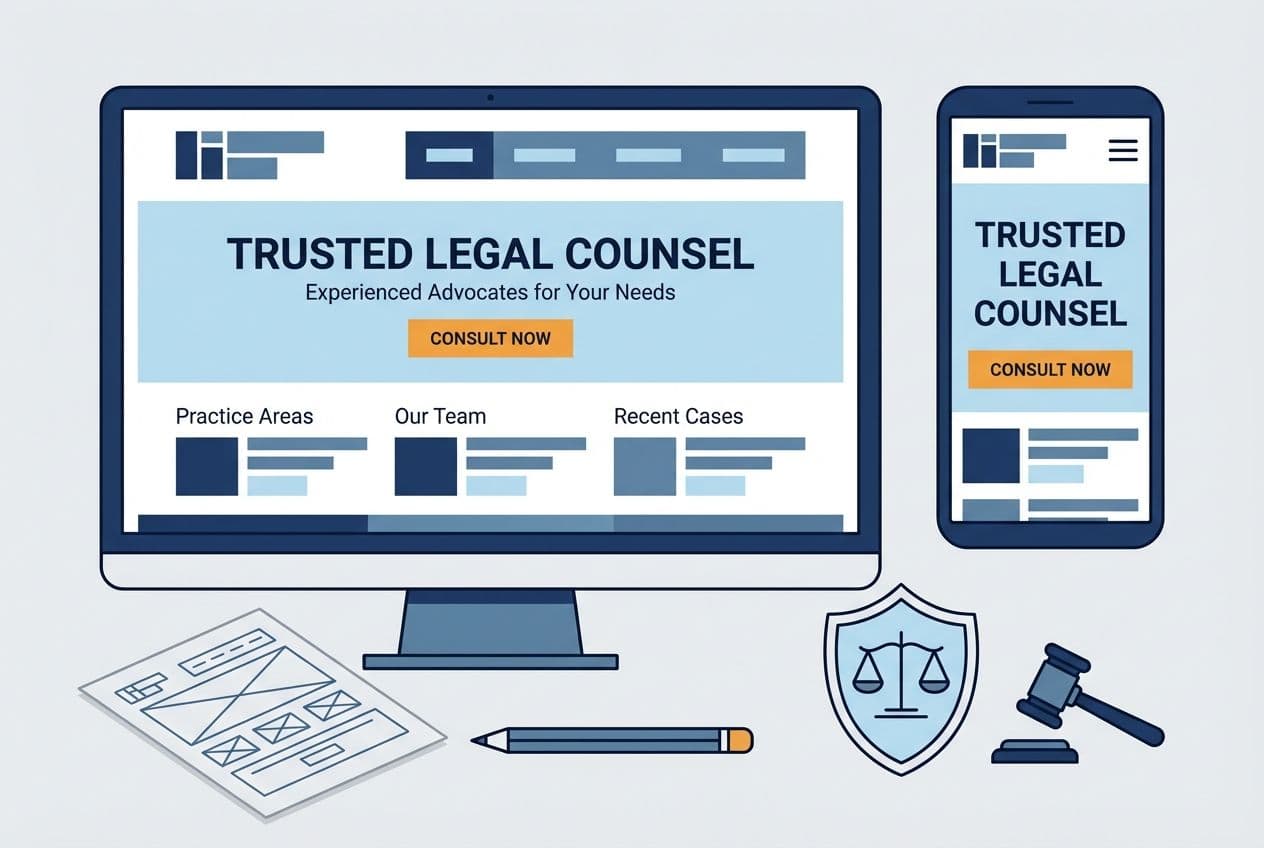
In the world of digital marketing, a perfect call-to-action (CTA) holds the key to turning ‘aimless visitors’ into ‘loyal consumers.’ But what makes a CTA persuasive enough to encourage internet users to convert? Why does your current CTA strategy fail to attract critical attention? And how can you create a call to action that is powerful and irresistible?
Fear not! We have the answers you need! In this guide, let’s discuss the top strategies for crafting a compelling call to action.
Why Is a Good CTA Important?
Imagine you are driving to a new destination and unaware of the route. In such case, the navigational system on your phone or car provides directions or CTAs to help you reach your destination timely and safely.
The CTA in your marketing campaign works similarly. They act like signposts guiding website visitors into taking the desired action. In the absence of clear instructions, potential consumers may become confused and leave your website without considering your offer.
Therefore, invest in clear, concise, and appealing CTAs to ensure your audience catches on to the ‘hint’ and completes your objective. Some common CTA’s include:
- Buy Now
- Subscribe
- Download
- Contact Us
- Try for Free
- Add to Cart
- Like a Post
- Share with Friends
Tips for Creating Strong CTAs
You need to consider several factors, such as placement, words, visuals, colors, and web design when crafting CTAs. Here are some tips to help you out:
- Make it Visible
Hardly any internet user would claim to read a webpage word-by-word. They would usually skim through pages and focus only on the highlighted points. They also find it frustrating to search for something between the blocks of content.
This means if your CTA is not clearly visible, your audience might lose interest and head to other pages. Most likely your competitors!
One of the best ways to ensure your CTA stands out is to use white space around the button. This will highlight the text and make it easy for visitors to decide.
- Use Visuals
Using visuals is another way to guide potential consumers toward your call to action.
This is a common practice in the real estate and luxury hotels industry, where marketers use enticing pictures to highlight their amenities. Combined with a catchy CTA, these surely make any visitor to stop, look, and take action.
However, make sure your pictures draw attention to the CTA - not take the limelight away. Emphasize the picture’s quality and avoid dark, pixelated images. If you are unable to source custom images, head on to a premium image library for a curated selection of visuals.
- Experiment with Colors
We are all familiar with color psychology and how it influences human behavior. Just take the example of the color red. This color instantly grabs the attention and stimulates a desire like hunger. This is probably why the color is a popular choice for marketing restaurants.
In contrast, the color blue instills trust, and green exhibits peace.
Study the emotion you want to provoke in the audience and choose the color for your CTA accordingly. However, don’t stray away from your brand colors and audience interest by choosing a completely ‘clashing’ hue. Instead, take into account every aspect of your marketing campaign and choose a color that seamlessly blends with the layout - while also generating interest.
- Think About Placement
You absolutely cannot throw a CTA wherever you want. They should be accurately placed in your web design, enabling the audience to make informed decisions.
Think from the user’s intent and experience. A CTA works like a directive, so would you be comfortable following one if it randomly pops up? Definitely, not!
Before adding a call to action, incentivize the potential consumers by discussing their pain points and the benefits they can expect from your product/services. Once they clearly understand the end results, put your request forward as a CTA. Only then will they be mentally prepared to take up on your offer.
- Play with the Urgency
FOMO (fear of missing out) is real and urges your client to take immediate action, believing they would miss out on the offer. Especially when the items are scarce, they are considered more valuable.
And speaking truthfully, many of us have surrendered to the countdown timers and limited-time offers by purchasing items we may not need instantly.
Use the same psychology by creating FOMO around your products and services. Show your shoppers that only a few items are left, or the discount will not last long. You can also display social proof by indicating the number of satisfied consumers of your brand.
- Embrace the Power of Words
A call to action generally starts with a verb like click, download, and submit. However, they are pretty much overused and generic. Instead, try powerful CTA like:
- Discover your talent!
- Grab the free offer!
- Try free for 30 days!
- Save your seat!
- Request a demo!
- Show me how!
- Boost my conversions!
- Score your job!
Align the verbs with your brand’s personality and voice. Phrases like the above examples are more emotive and entice the audience to take logical action.
- Test your CTAs
Once you have played around with different call to action, conduct an A/B test to determine which performs the best. Modify one element: words, color, placement, or visuals in different CTAs.
Run them for a specific duration and compare the results of each. Analyze the data to determine which CTA attracts the audience’s attention and fulfills your conversion goals.
Conclusion
Now that you know the elements of a compelling CTA, it’s time to take the time and effort to create one for your next campaign. Use the above tips to map out a strategy - and a call to action - to convert the visitors.


